CREATIVE MOBILITY
HDC-M is a multi-disciplinary design studio based in Munich, working for a variety of brands in the transportation industry.
We are researchers, strategists, industrial designers, graphic designers, color specialists, 3D modelers, photographers, visualisers and dreamers, united by a passion for creating products which build strong brands through having a positive impact on people’s lives.
How can we help you?
MANIFESTO
Agile Design.
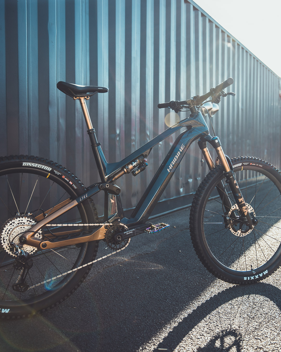
Since 2016 we have been optimising our services to match the rapidly evolving needs of our clients within the eBike industry. We have built a team and processes primarily in the areas of Industrial Design, Visualisation and Color, trim & graphics.
To complement these services, we work on research, strategy, brand, communication, ideation, frame design (2D &3D), visualisation (2D &3D), decal files and sample reports to create optimal product market fit.
Together with our partners, we are constantly evaluating, updating and optimising our way of working to help bring products to life in the most efficient and profitable way.
Design is the manifestation of a strategic vision, which we help our partners bring to life, through product aesthetics, feel and function. – HDCM

Process.
In order to ensure the products we design hit the mark, and meet no hiccups in production, we have spent the last years creating reliable processes capable of converting the required inputs into the desired output.
There is never a dull day on the job and we feel blessed to be able to work in such a great industry, designing products which have a positive impact on peoples lives. Not to mention we love riding the bikes ourselves!
In the last years we have become huge advocates of using first principles thinking as a mental framework for operating, along with a strong focus on a positive growth mindset.
Services.
Trusted partnerships.
We believe in forming strong, long-term relationships with our clients. We know that trust and consistency are key to successful collaborations, and we strive to ensure that our clients feel secure and confident in our capabilities. We want to become an extension of our clients’ own teams, so we can create a level of familiarity and comfort as we work together. We understand that it’s important for clients to feel that their needs are being heard and addressed.
As a result, we place a strong emphasis on communication and strive to offer prompt and helpful responses to any questions or concerns. We take the time to understand our clients’ goals and objectives and make sure that the project is on track and going in the right direction.
By working together over the long run, we can learn and grow together, to always improve with each project, in order to realize the full potential of the collaboration.